CASE STUDIES
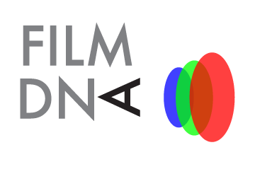
I designed a logo for screenwriter and film director Greg Marcks’ now defunct film podcast FILM DNA. Keeping in mind the small thumbnail that would be visible for the podcast on apps such as iTunes, I made a distinct, clear and bright logo that could be legible at various scales and configurations. The focus of the design is the rotated A that becomes an eye viewing the three color sensitivities that make up film (red, green, and blue).
INTRODUCTION
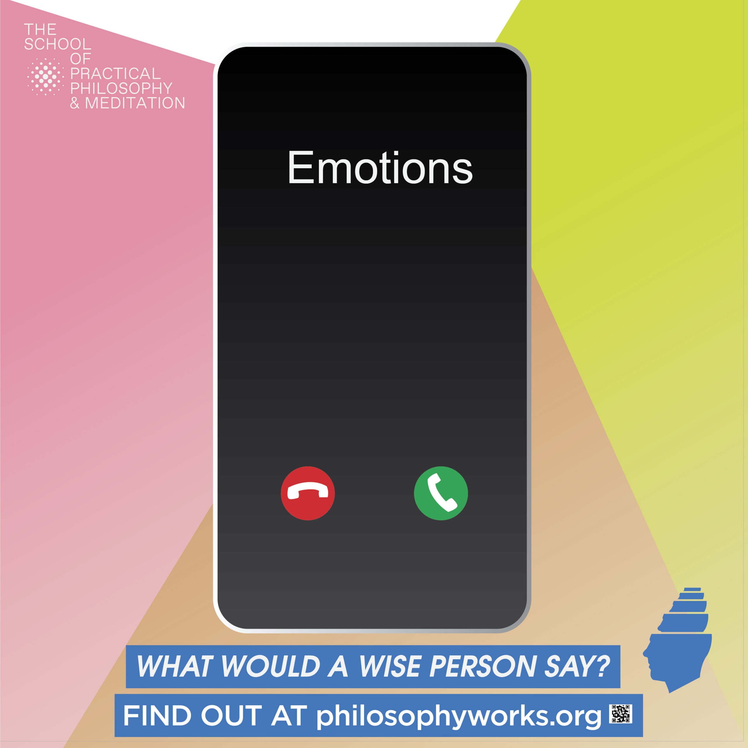
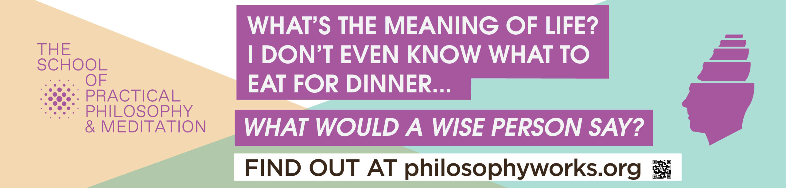
The client has had a year over year declining enrollment of predominantly 50 and older students. The School was ready to invest in a campaign targeting a younger demographic of 20 to 40 year olds.
CHALLENGES
How to get the attention of NYC straphangers while not appearing like a cult or a scam.
SOLUTION
My strategy was to use humor about everyday problems with a modern mid-century aesthetic and one of the self-reflexive questions the School tells all students to ask themselves when conflicted about a decision “What would a wise person say?”
![]()
11:14 FILM OPENING CREDITS
This is an opening credits mock-up proposal for filmmaker Greg Marcks‘ debut feature length film 11:14 which he wrote and directed starring Patrick Swayze, Hillary Swank, Colin Hanks, Ben Foster, and Rachel Leigh Cook. The film is about the events leading up to an 11:14 p.m. car crash from five very different perspectives. Referencing the digital clock featured in the film, my design and animation hinted at the storyline of the intersection of people and time, but also the passage of time.
SSCY BAGS
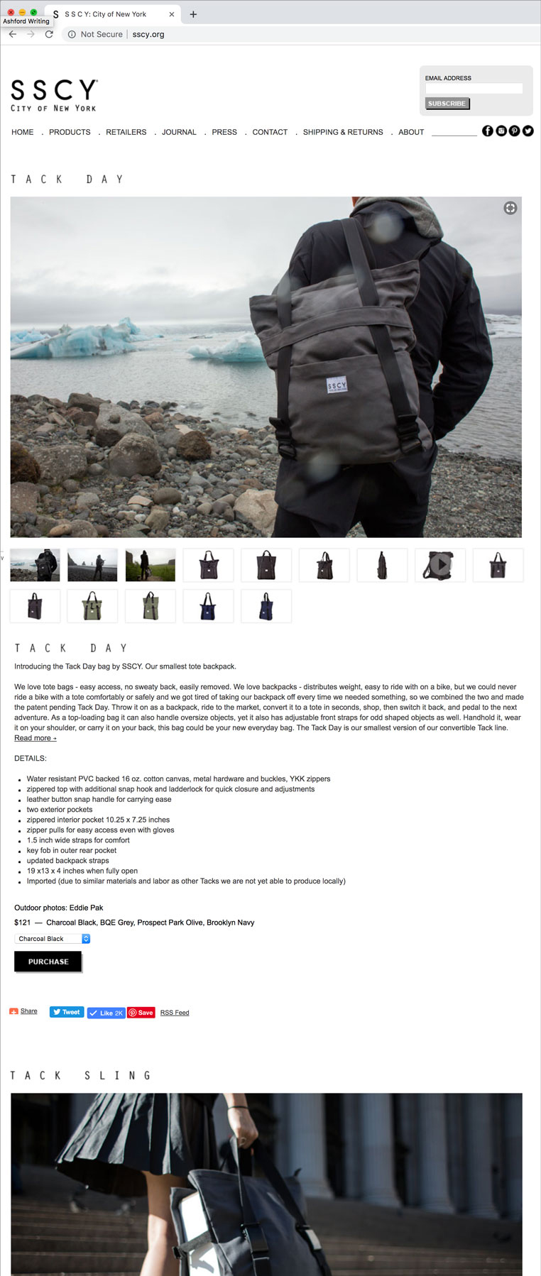
For my bag company SSCY, I realized the key aspect of branding and the website would be to educate the consumer in order to make a sale. I also had to create a brand, a logo, and an image to sell the product. Most importantly, though, I had to tell a story of how it could be used and why one would need it. Knowing a single photo on a website would not be clear enough to sell the product, I intentionally chose more of a blog format over the common ecommerce grid format. The customer needed to see the bag more holistically, not only as a lifestyle product, but also its functionality embedded in a narrative in both image and text. I shot photos that felt elevated in order to not only justify its price, but also relay a sense of quality, desirability, intelligence, good design, and a sense of style and adventure. I, then, wrote succinct copy that detailed not only the features/selling points, but also noted use case scenarios in a friendly, fun, and adventurous tone.
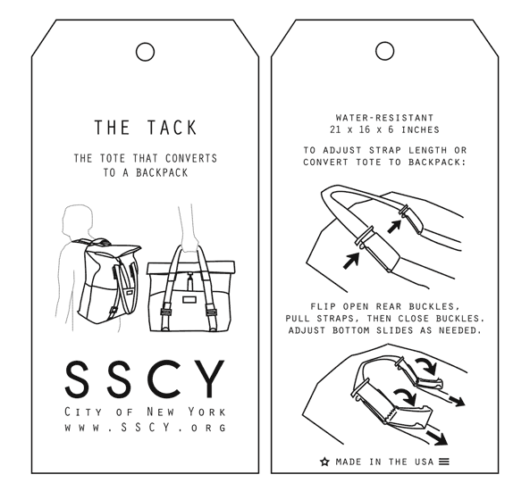
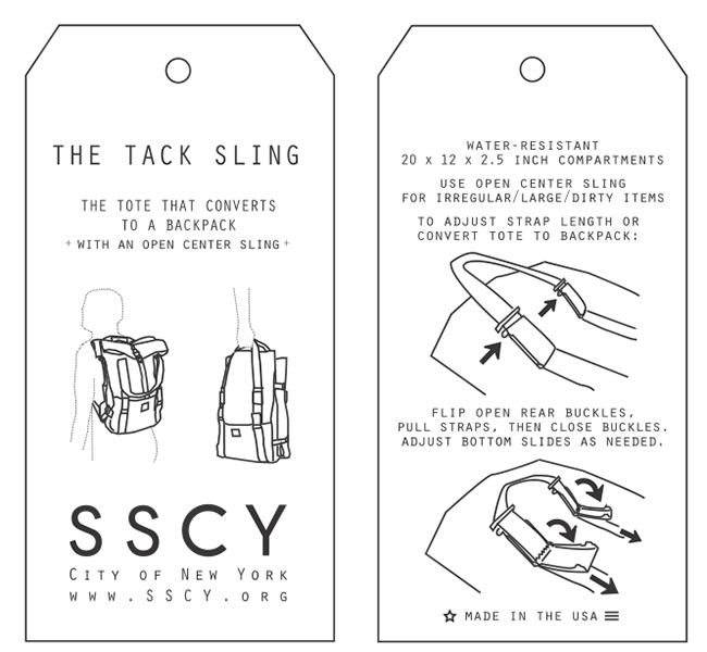
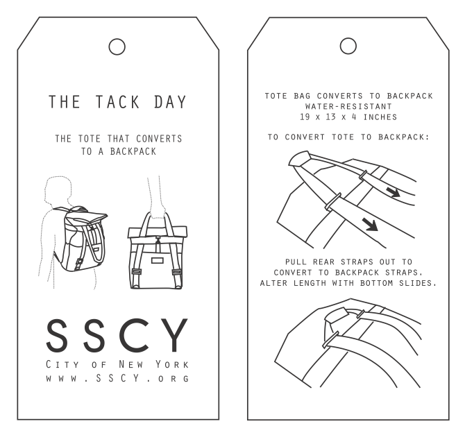
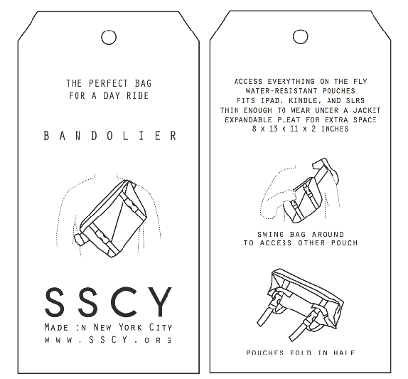
As I started to sell at trade shows and fairs, I needed a postcard for customers to take that displayed the product (as opposed to merely a logo or otherwise) as a clear reminder for possible sales later.


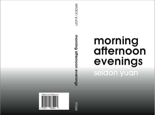
Book cover design for my first book of poetry MORNING AFTERNOON EVENINGS.
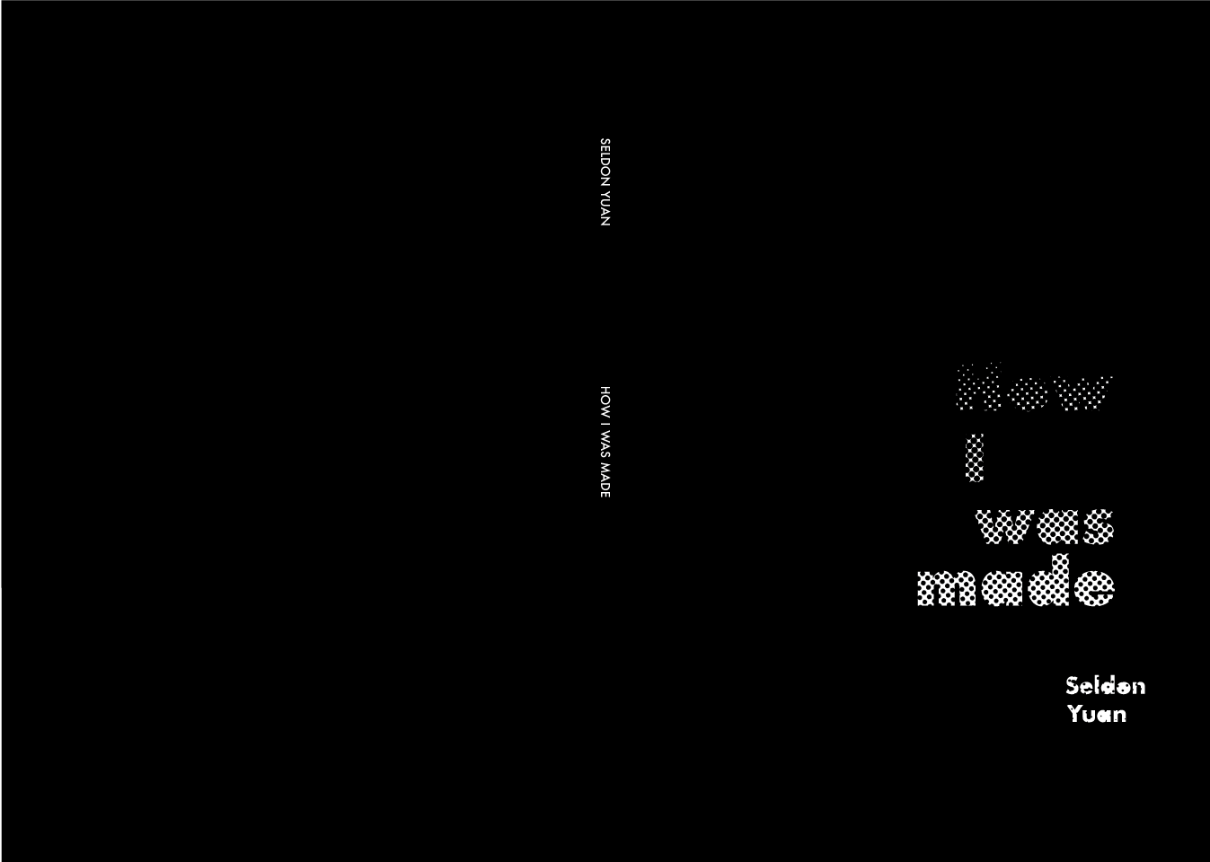
Playing off the initial design language of my first book, I designed the cover for my second book of poetry HOW I WAS MADE to play off the first design.